Overview
Monitoring patient's vitals is crucial for early detection of potential health issues. This design project focuses on building analytical & trend view to detect anomalies in patients' lab vitals. By identifying these irregularities promptly, primary care provider or care manager can improve patient outcomes and streamline medical interventions.
Key areas include:
Types of Vitals Monitored: Blood pressure, heart rate, respiratory rate, temperature, height, weight, BMI & total of 13 vitals
Data Ingestion: EMRs & manual entries

Context
About Patient 360
Patient 360—one of the major building blocks of Innovaccer’s InCare platform—helps provide care managers with a holistic view of patient data by streamlining processes and saving time. It houses the exhaustive medical data of a patient, ingested from multiple sources including EMRs & manual entries. This tool also houses actionable data and helps users drill down into patients’ claims, risk models, and personal information, ultimately enabling a higher quality of care.
This product mainly caters to the US healthcare market, so the terms Care Manager, Primary Care Provider might feel new. So to understand this solution, assume that all these personas are the people who work in the hospitals, mainly doctors & nurses.
Problem Space
Why Now?
Our decision to address the current issues and improve our system was driven by several critical factors. Here's why we chose to act now:

Our Net Promoter Score (NPS) had dropped significantly to **, raising concerns about customer satisfaction and loyalty. This decline was also highlighted in the quarterly USAT (User Satisfaction) surveys, where customers pointed out specific issues that had been hampering user's workflows.

The competitive landscape was rapidly evolving, with similar products, such as Google’s Care Studio, introducing advanced analytical views and features. To stay relevant and competitive, it was essential for us to enhance our offering and keep pace with these innovations

Internal UX evaluation sessions conducted earlier and more recently had identified several usability issues. Although these issues were recognized, they had not been prioritized due to a lack of clarity on their potential impact. The recent decline in NPS and the competitive pressures underscored the urgency to address these usability concerns promptly.
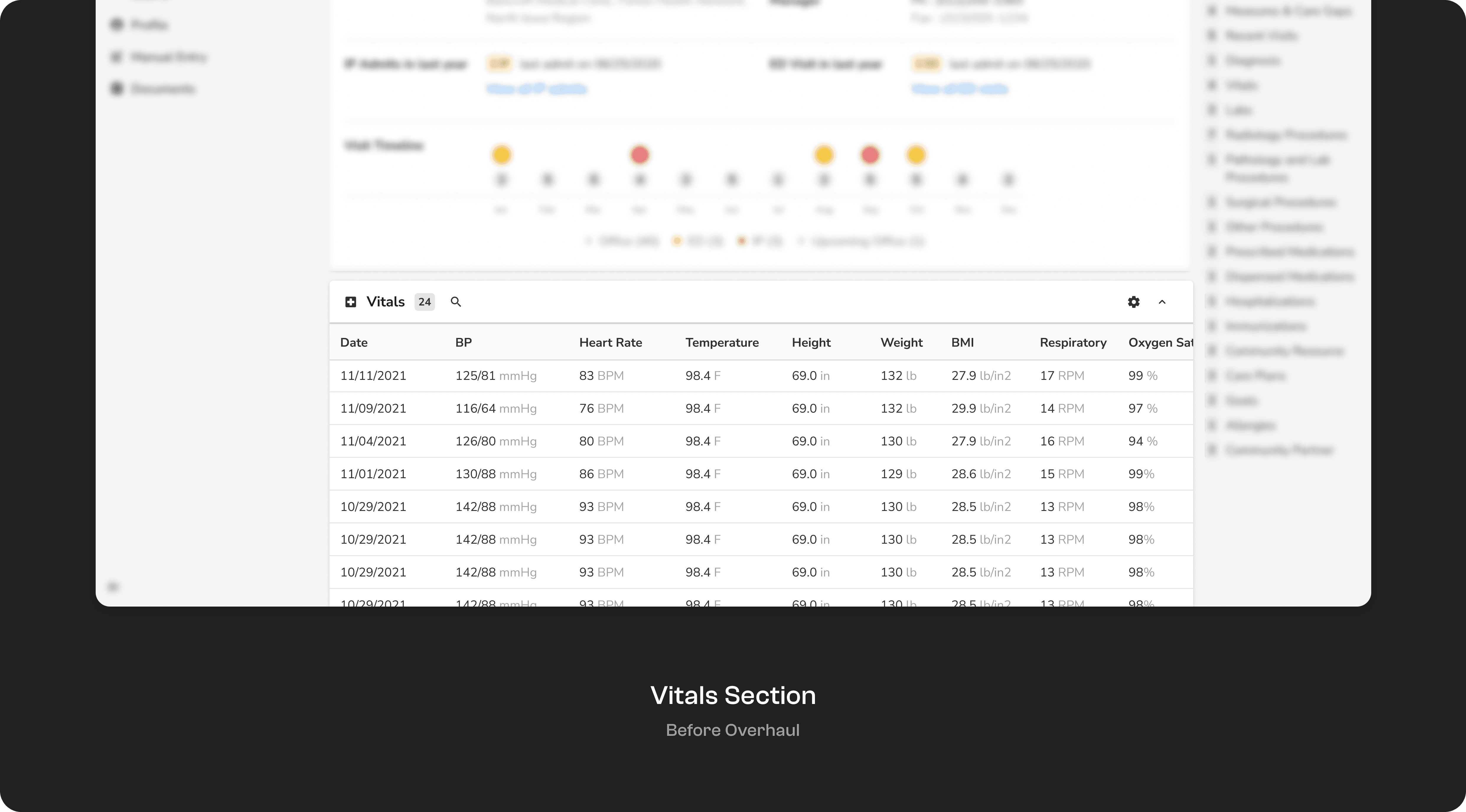
Research Summary
User Research Strategy : Understanding User's Activity inside the Hospital
Despite having well-defined personas, I aimed to gain a deeper understanding of how vital data is utilised in real-world settings and the various workflows associated with it.
Challenges and Constraints
One of the main challenges was the limited access to users, which required careful planning for our research approach. Direct user interactions were infrequent due to permission constraints, necessitating alternative methods for gathering insights.
Research Methodology
To overcome these limitations, we employed several alternative research methods, including:

SME Interviews: Conducting interviews with (SMEs) Subject Matter Experts, who have indirect user interactions & have industry experience, to understand their perspectives and gather insights..
USAT Survey & Secondary Research: Reviewing existing confluence documents, jira tickets, and USAT Survey reports to gather initial insights.
Competitor Analysis
Analytics Data
Data around vitals section, user journeys originating & passing through this section, type of users utilising this, user's idle time & engagement time & also the type of vitals enabled by the admin per customer.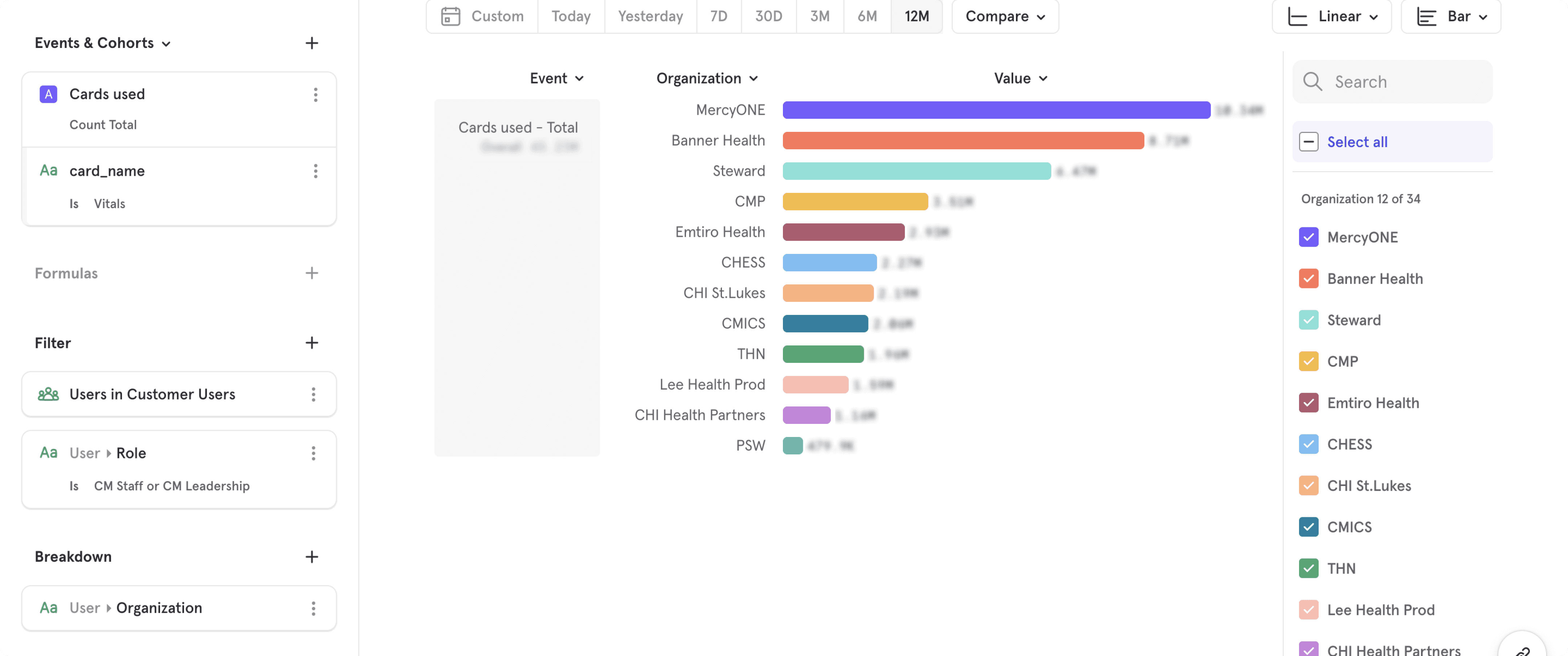
Way more reports & insights were generated but cannot be shown here due to data privacy & confidentiality
First Iteration
Building on what we already have

Considerations
In B2B products used by multiple enterprises, it’s imperative to avoid drastic alterations to existing workflows. Instead, updates should be rolled out systematically and with an option for users to revert to previous versions if necessary. This approach led me to impose constraints on myself to prevent major changes and instead build upon the existing structure.
Understanding Users & Ideation
Apart from understanding user flows & needs, I conducted a detailed analysis of competitor offerings and collected insights.This helped me understand why certain design decisions were taken by competitors & if those decisions would be beneficial for us. Additionally, I placed other concept images & mockups to help me think beyond the existing systems.
Brainstorming, ideation & stakeholder session activities were also done in the same file. it eventually became a repository holding all the ideas, the discarded designs, inspiration & decision log.


Selected Exploration
Among the different explorations, the option that showed the most promise for further iteration involved a hybrid approach. This solution allowed users to view tables along with mini visualisations. Here’s a breakdown of this option:
Trend Visualisation: Users can see trends in patient vitals through colour-coded mini graphs.
Coloured Indicators: Anomalies are indicated by different colours, making it easy to spot issues at a glance.
Interactive Elements: Users can tap on these visualisations to see more detailed information about the anomalies.
Trend Lines: Straight lines indicate stability, while more ups and downs suggest significant fluctuations.

After showcasing this internally, it was evident that this solution would not solve the problem completely & was just a nice way to increase use cases without causing change anxiety. The main feedback points included:
Accessibility of Details: Internally, people found it inconvenient that detailed information about anomalies required an additional click. Although the mini graphs indicated issues, tapping on them to see specifics was seen as cumbersome.
Customisation Limitations: The mini graphs had limitations in terms of customisability, such as changing date ranges and scales. These constraints made it less useful for users needing in-depth analysis.
Does not solve completely: There was a strong desire for immediate insights and actionable information without having to navigate through tables or multiple taps, which are not optimal method of data consumption here.
More Iterations
Iterations & A Better Direction
Refining the Approach
With better clarity and confidence from the team, I returned to the drawing board to address the identified issues. Here's how I tackled each challenge:
1. Overcoming Change Anxiety
Solution: Provide users with the flexibility to toggle between different views. The default view can be set by the admin and adjusted by individual users based on their preferences.
Implementation: Incorporate a toggle feature that allows users to switch between different views seamlessly. Admins can set the default view, while users have the option to customise it according to their workflow.
2. Adapting to Different Personas' Workflows
Solution: Save layout and configuration settings at the user level to ensure adaptability to individual workflows.
Implementation: Implement a system where users can customise layout preferences and other configurations, and these settings are saved at the user level for a personalised experience.
3. Streamlining Interaction with Graphs
Solution: Make graphs interactive and display them upfront to reduce the number of clicks required to interact with them.
Implementation: Enhance the interactivity of graphs by allowing users to hover over data points for additional information and insights. Display key graphs prominently on the interface to ensure easy access and quick analysis.
Building with clear objectives
With clear objectives & focussed approach, I was able to build two variations targeting different use cases. Two Variations?? Maybe you did not have that clear objectives after all. Usually that's the case but since we were targeting multiple personas with different use cases and also with a strict deadline, I needed to think a step ahead & provide the psuedo users with different design options for quicker & better decision making. Both of the design options seemed capable of solving the pain points but with different primary usage methods.
User Feedback
Feedback
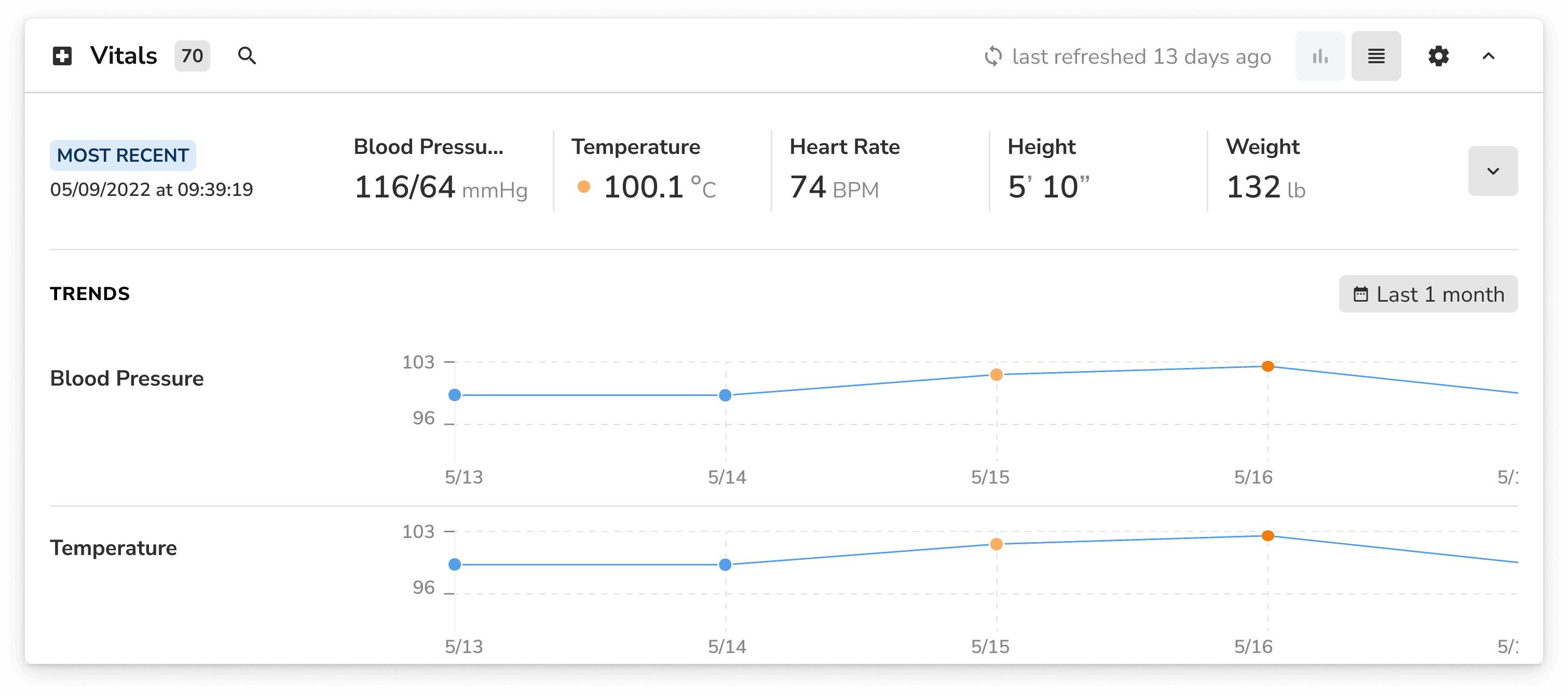
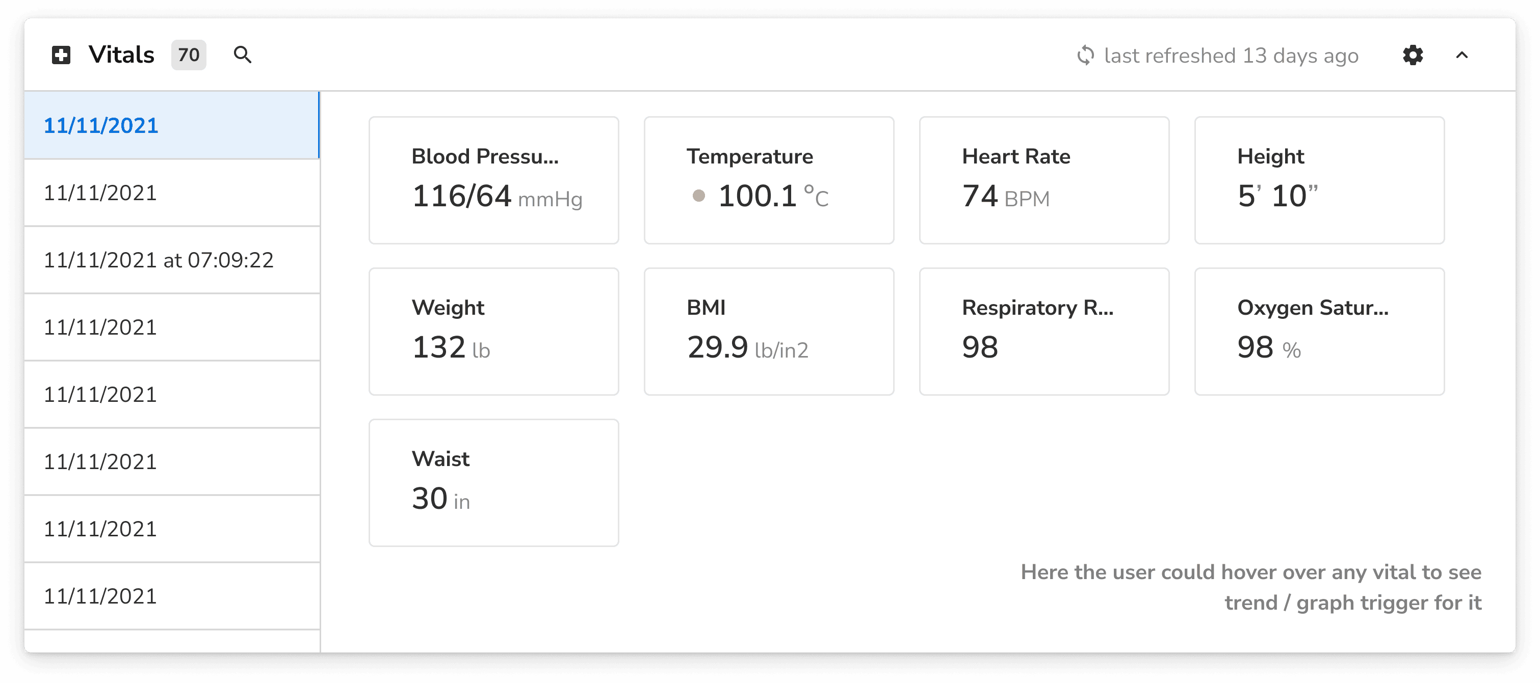
With the completely new version ready, we presented it to the internal team and Subject Matter Experts (SMEs) for feedback through a series of interactive demo sessions, detailed walkthroughs, and usability testing. The response was very positive, and we received their soft approval. The stakeholders were excited to see the new direction and appreciated the efforts put into addressing the previous issues.
However, there were some things we still had to work on. These included mainly the feasibility & speed related aspects of this solution.
Feasibility of Multiple Graphs: Team members questioned how many graphs could be feasibly included on the interface without overwhelming users or causing performance issues. The concern was to balance the amount of data displayed with maintaining a user-friendly experience.
Data Standardisation: Our product integrates data from multiple sources, which often results in varying units and formats. Typically, we do not standardise data units to avoid potential issues. However, for plotting graphs, standardisation was essential. I devised unit conversion logic to handle basic scenarios, edge cases, garbage data, default units, and a comprehensive list of all possible units.
Interactivity Without Lag: There were questions about the feasibility of making the graphs interactive while ensuring they remained responsive and smooth. We had to make sure with the devs before hand that multiple graphs could be loaded parallelly.
Loading Time: A major concern was the potential loading time for the new interface, especially with multiple interactive graphs and data points. Ensuring quick load times was critical to maintain user engagement and satisfaction, especially in an environment where every second matters.
Impact on the DOM: I decided to involved devs earlier to ensure that the new elements would not significantly degrade the performance or increase the complexity of the DOM.
Other Improvements
Beyond the Basics : Other Improvements
Beyond addressing the technical concerns discussed earlier, we implemented several finishing touches to ensure a comprehensive and user-friendly solution. These enhancements were aimed at improving usability, customization, and data accuracy, providing a more polished and effective tool for our users.
Minimising Change Anxiety
Retain & Improve Tabular View: For users who prefer or need to consume data in a tabular format, we enhanced the tabular view by adding features such as column resizing, standardised units, and anomaly markers. These improvements ensure that users can easily interpret and interact with the data in a format they are comfortable with.
The last opened view (Graph or Tabular) is saved as default view for next visits.
Tracking and Customisation
Mixpanel Tracking: We enabled tracking on Mixpanel to monitor the usage of both views (graphical and tabular). This allows us to gather insights on user behaviour and preferences, helping us make informed decisions for future updates.
Admin Configuration Settings: Admins can now set default configurations for the interface, ensuring a consistent starting point for all users. This includes setting default views, time periods, and other preferences.
User-Level Customisation: Users can modify and save their configurations at the individual level, allowing them to personalise the interface to better suit their workflow and preferences.
Graphical Enhancements
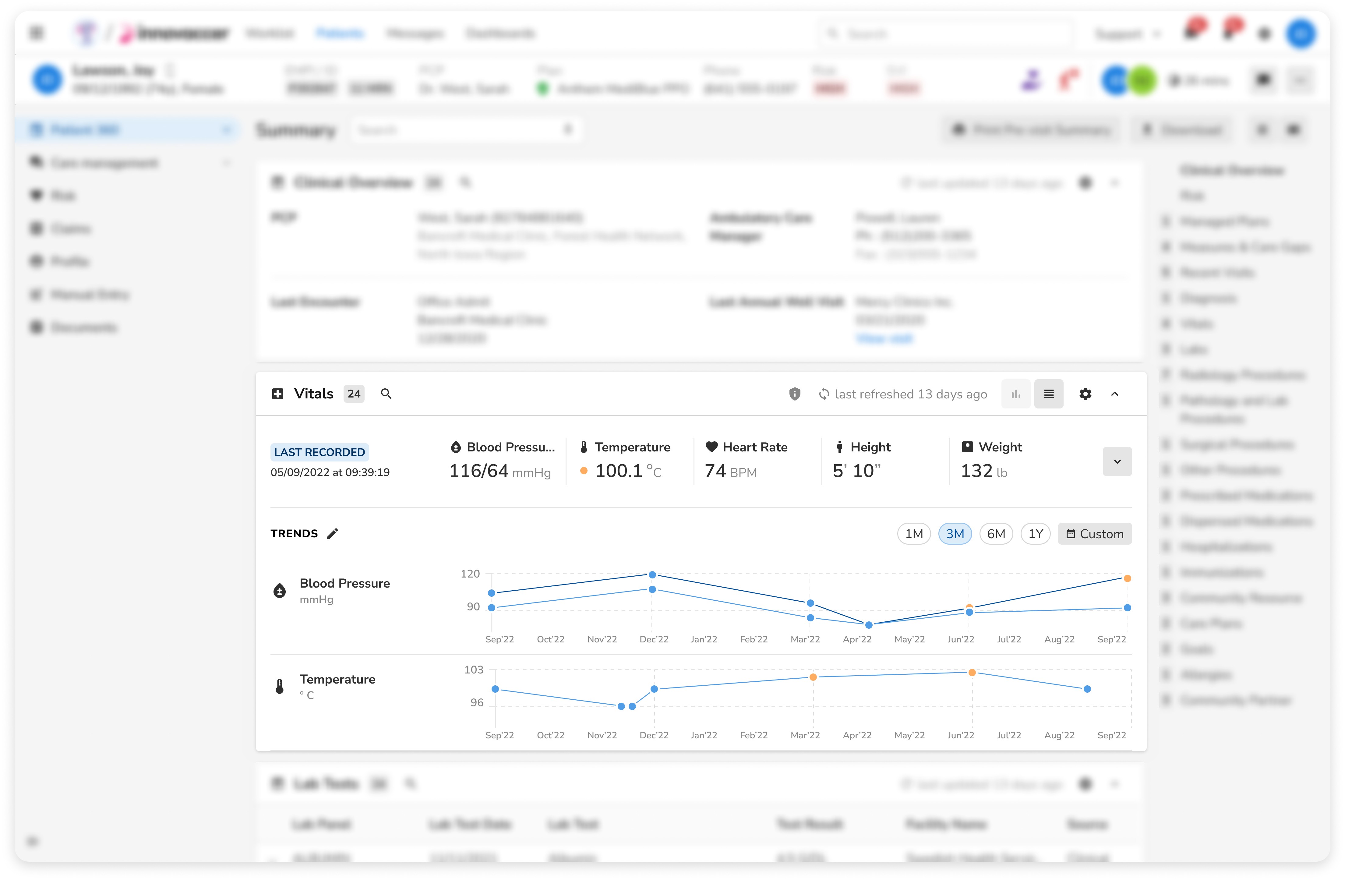
Default Time Period: The default time period for graphs is set to one year (1Y), providing users with a comprehensive view of trends over a significant period.
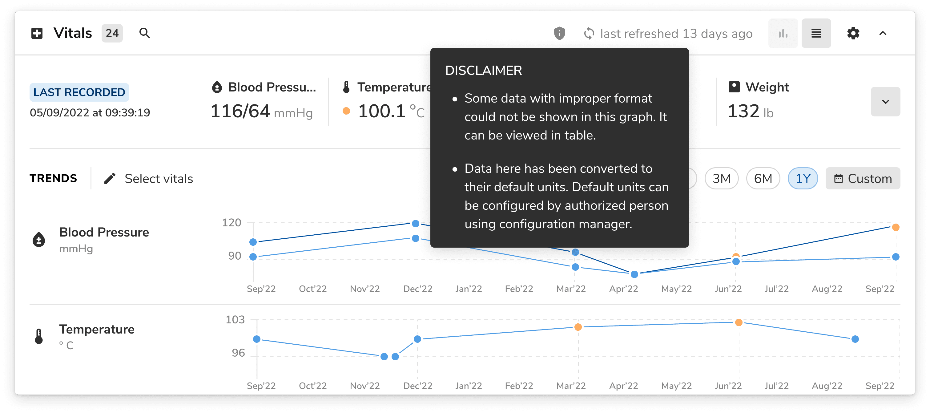
Blood Pressure (BP) Graphs: For BP data, we created an exception case where one graph displays two trend lines, each with a different colour to represent systolic and diastolic pressures.
Original Data on Hover: For converted data, we implemented a feature that shows the original data when users hover over the graph. This provides transparency and allows users to verify the accuracy of the converted values.
Handling Duplicate Data: We adjusted the system to account for duplicate data entries, ensuring that the graphs and tables present the most accurate and relevant information.
Document Integration: Each record now includes links to related documents, which are displayed in both the table and graph views. This integration allows users to access supporting documentation directly from the interface, enhancing the context and usability of the data.
Special Case
Dynamic Date Range Adjustment: If there are no records of the selected vitals in the past year, the default date range automatically adjusts to the last record year to ensure that users don't have to spend time doing it manually & get the most recent records visible always.
Legal
Navigating Legal Waters & Avoiding Lawsuits
In the healthcare industry, data discrepancy is not acceptable. Even a single mistake could cost lives and result in severe legal consequences. As our product integrates data from multiple sources, we frequently encounter challenges such as garbage values, duplicate data entries, incorrect units, non-existent units, and typos. Navigating these issues required a careful and considered approach to ensure data integrity and avoid potential lawsuits.
Addressing Data Discrepancies
Identification of Problematic Data: We recognised that hiding erroneous data was not an option, nor was plotting it incorrectly. Utilising UX methodologies from established healthcare tools like EPIC EHRs and Google Health Cloud Care Studio, we devised a method to handle these discrepancies transparently.
Neutral Visualisation: We implemented a neutral approach where erroneous data points are displayed as grey dots. These dots are positioned at zero on the Y-axis, maintaining their correct X-axis position. This approach ensures that users are aware of the presence of problematic data without it misleading the overall trends on the graphs.
Disclaimers
Permanent But Hideable Disclaimers: To ensure users are informed about data discrepancies and unit changes, we introduced permanent but hideable disclaimers. These disclaimers provide detailed information about the nature of the issues and the steps taken to address them. Users can hide the disclaimers if desired, but they remain accessible for review at any time.
Final Solution
What we shipped (For v1)

Final Solution
This is what we finally shipped to our users!
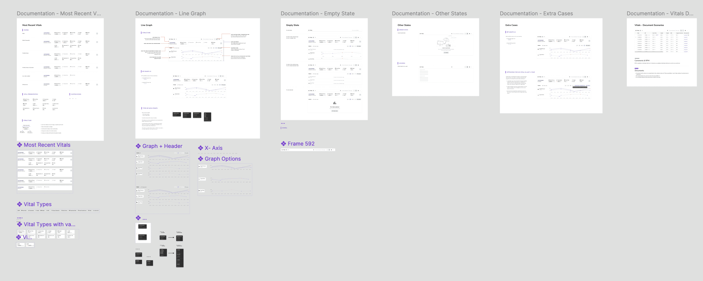
And also the enormous amount of documentation shared, some over figma and some over Confluence & Jira.
After conducting SME interviews & multiple internal discussions & also a design critique session with the larger design team, we felt really confident to launch this major update for (almost) all users.
Lot of under the hood improvements & logic updates were done before development & some during development.
This was going to be a major change & I wanted to to avoid any issues due to time adherence. So we decided to roll it out in phases & monitor user activity closely.
Retrospective
Challenges & Takeaways
Justifying the Major Upgrade: The major challenge was to back myself & build the case for why a major upgrade was required instead of just an update. This involved highlighting the limitations of the current system and showcasing the vision, it's impact & it's future implications.
Stakeholder Alignment and Structural Changes: Since this was a deviation from the current structure of all the sections of P360, it was difficult to align the main stakeholders on this design direction.
Adherence to Sprint Timelines: And the final challenge was the adherence to sprint timelines. A systematic plan was created to allow for the key functionalities to be delivered quickly & push non-critical updates gradually. This would also allow us to push any required updates after monitoring early usage.
