Overview
Building the design system at Zetwerk was a massive undertaking, done parallelly with product design tasks. It took a bit more than four months to get it up and running from scratch, almost single-handedly. While the approach I took was different from ideal due to the constraints & design process maturity, however the foundations were still based on the atomic design principles.
At Zetwerk, we have many large products, each with very different design languages. In some cases, there were inconsistencies across pages of the same product driving down usability. This inconsistency affected developers as well since they weren't using any component library and it took more time to build anything. As Zetwerk was growing rapidly and on the verge of becoming one of the fastest unicorns in India, we needed to improve our design and development turnaround times. This necessity led us to build a comprehensive design system.
Benefits of a good design system are quite significant:
Accelerate time to market
Achieve UX consistency
Improve team collaboration
Why me?
Given my previous experience with design systems, I decided to take up everything related to building the design system. This was an optional thing but we were in dire need of a design system. This would have impacted my bandwidth slightly for some time but eventually it would have resulted in enormous benefits to all the designers & later developers.
Approach: Usage First & Atomic Design
I had to decide on an approach that would allow us to show results quickly, even if it wasn't the most systematic method. If the results were significant, our product leadership would allocate more resources for this enabling faster & dedicated work.

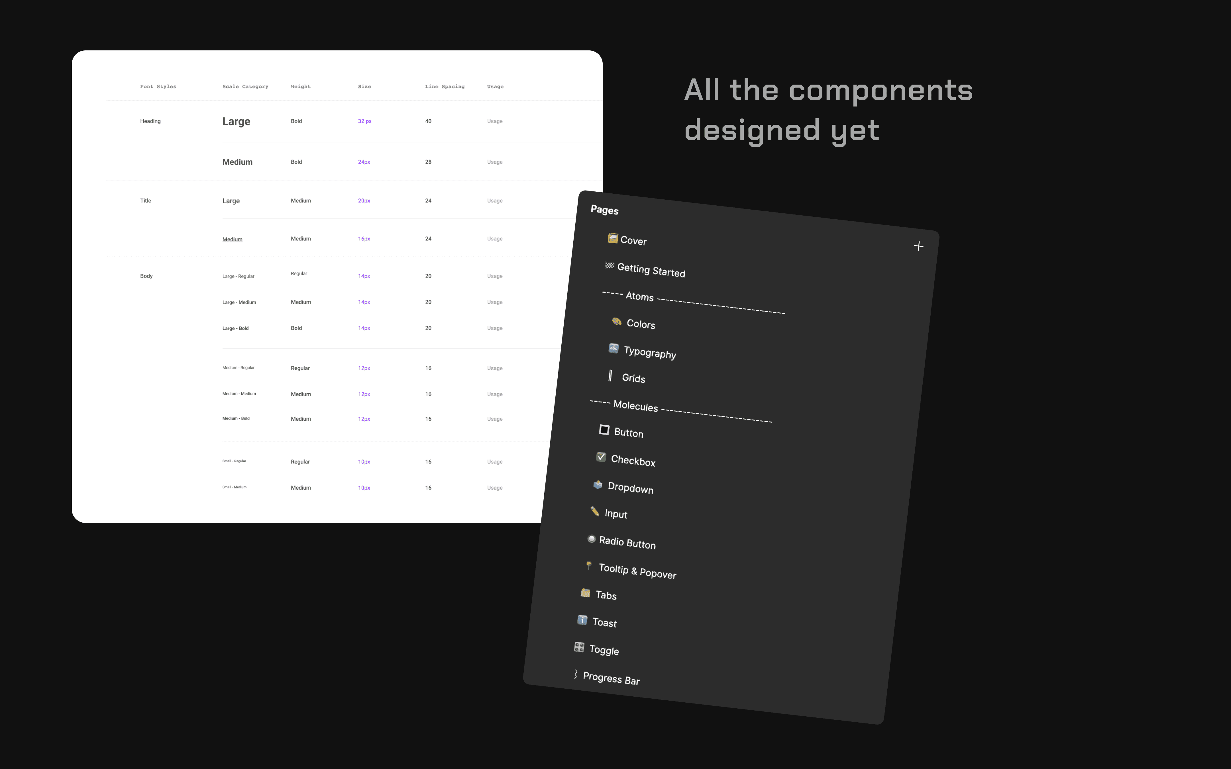
This was going to be built based on the atomic design philosophy. My plan was to build these atoms first since this will act as the foundation of the complete design system. This includes things like typography, colour styles, grid, spacing, styles & more. However I took a different approach and decided not to define all tokens and layers at the outset and instead create them as needed. This would allow me to get single component live faster & without any caveats.
Do remember that these were the early days of design systems, and with Figma not yet the primary tool, we had limited access to commercially available design system files for Sketch.

Getting Started: Design Audit
Next, I needed to understand the variety of components in existence. Given our large scale products with quite peculiar use cases, in some cases we had quite different design styles. Even simple components like input fields were heavily customised. So I brought the entire team together, and we did a group session where we collected instances of all components in Sketch (we used Sketch initially for brainstorming). We also determined the usage trend of these components so that the right component creation could be prioritised. This was no small feat. It took a while to go through all the collected components & understand their usage across all the Sketch files.
Building it & Documentation
We used Abstract with Sketch for version control. Abstract was the key to manage this design system so the next step was to set it up with proper naming convention & file structure.
To ensure stability, I tested the WIP design system file on the products I've was designing for, ZISO - Project Management suit for the manufacturing industry. This product had extensive use cases, was high impact & I had maintained the design cleanly thus making it the right choice for testing. I tested accessibility, responsiveness, exportability, and more for over a month.
Bit by bit, I created each component and the design system was taking shape. It took me about 4 months to get all the main components ready from scratch while working parallelly on product design. Once all components were designed, I thought the hard work was done but I couldn't have been more wrong.
The detailed documentation needed to be created now with the necessary descriptions and the anatomy of the components, such as margins, height, and width. This was a slow step & is still underway. However, we did now wait for the documentations to be complete & after careful review by other designers with subsequent tweaks and fixes, the design system finally went live.

Governance Process
For the evolution of the design system, I created the governance process also created at this stage. To create further components, update or create new variants of existing components, prevent bad decisions, encourage creativity within boundaries & enable transparency, a governance process is an absolute must. There was information available online related to this with proper steps & methodologies but I wanted this to not miss any edge cases that one might encounter while building design system used for large scale products.
I connected with a OLA senior designer over Linkedin & learnt their way of doing it. It was not different from what was available online but the conversation enlightened me about the issues that design team sometimes run into with snowflakes vs product specific components vs design system components. Here' our governance process (without the development workflows)

Design to Dev Components
The next phase starts when developers build this library into usable code components. Since the beginning of the process, we were closely in-sync with developers to adopt dev friendly practices & naming conventions. The developers are now having discussion & preparing plan to build it. It will take a while for it to be fully up & running but it will be worth the wait.
Design System vs Design Library
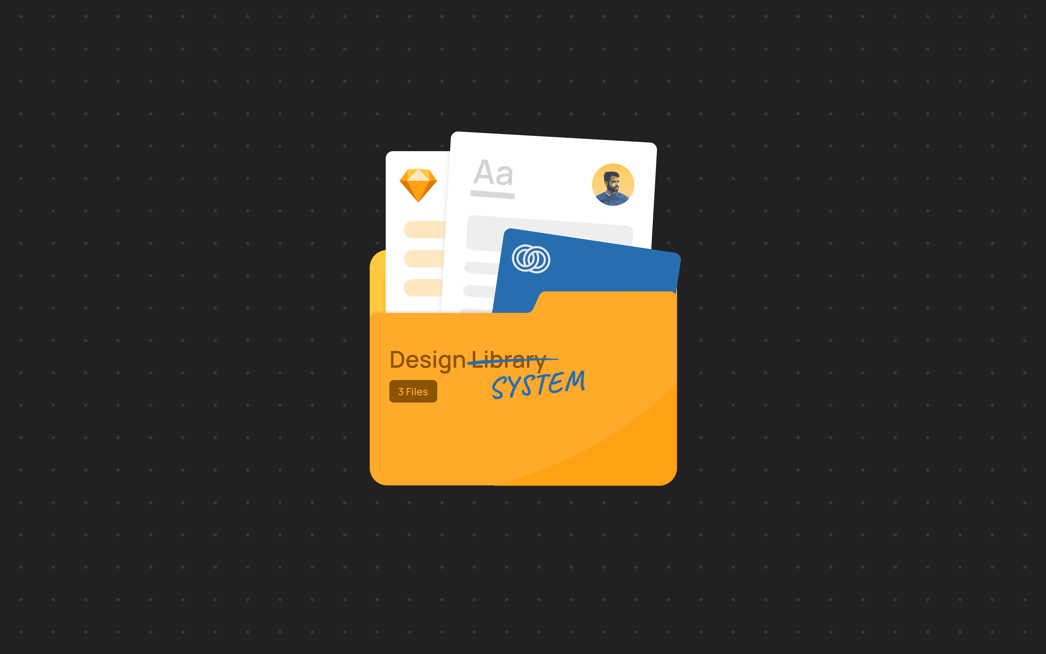
I have been calling it a Design System till now but in reality it's a Design Library at this stage. Design library as a collection of pre-built UI components, like buttons, forms, navigation bars, etc. These components are like building blocks that designers and developers can reuse to quickly assemble interfaces.
Design System is a broader concept that encompasses the design library but also includes accessibility guidelines, interaction guidelines, brand style guide, illustration library. In short, a design system is a comprehensive set of resources that defines the entire design language of a product or product family. It ensures consistency not just in visuals but also in functionality, usability, and accessibility.
If we were to build a house:
A design library would be a box of pre-fabricated walls, doors, and windows.
A design system would be a complete blueprint that specifies the architectural style, materials, construction methods, and even furniture recommendations.
Next Steps
Creating the design system was just one part of the process. There's a lot that happens after it's built:
Guiding designers on the usage of the design system, linking it with their design files, and pulling design system updates
Helping designers improve their workflows around design components using Sketch shortcuts
Creating an interaction design and usage patterns library to ensure not just consistent visuals but also usability standards
Assisting in translating the design system into a developer component library
